Skip to content
Premium Themes for Shadcn UI product render
Overview

About Premium Themes for Shadcn UI

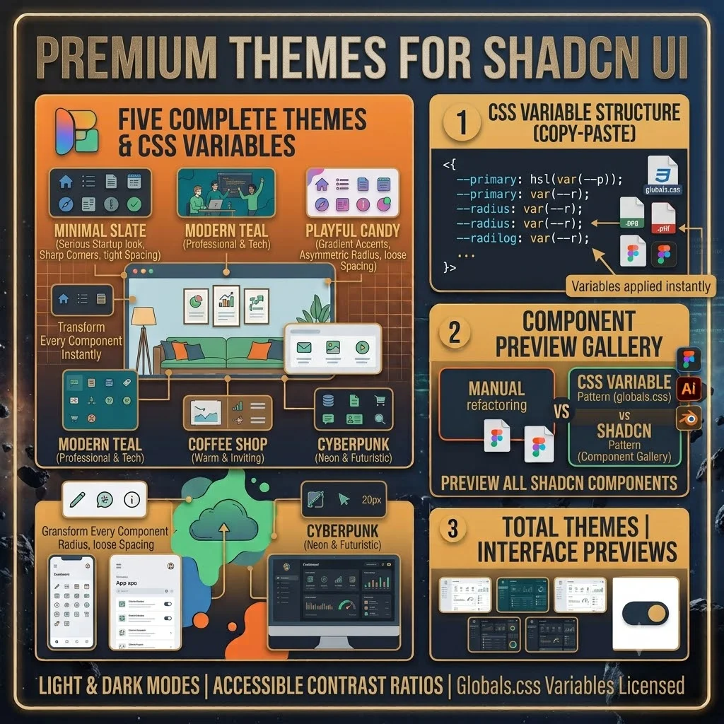
Five Shadcn UI themes for those times when you want your app to look like someone actually thought about the design. Each one’s a complete set of CSS variables — colors, border radius, spacing, typography scales — that you paste into globals.css and every Shadcn component transforms instantly. No code changes, no refactoring, just different variables.

They range from “my startup needs to look serious” (Minimal Slate: sharp corners, tight spacing, neutral palette) to “let’s have some fun” (Playful Candy: gradient accents, asymmetric radius, loose spacing). Every theme ships in both light and dark modes with contrast ratios that won’t hurt anyone’s eyes. The preview gallery shows every Shadcn component — button variants, cards, dialogs, inputs, selects, tables, tabs, badges, avatars, alerts, navigation — rendered in each theme, so you can flip through and pick your favorite before committing.
License & Delivery

Instant & secure delivery

Every product is delivered instantly. Following purchase, you receive an immediate redirection to a secure page with download links for your files, templates, or prompt libraries. The links are also sent to your email address and stay active permanently.

You can customize, duplicate, modify, and implement all assets in both personal and commercial projects without any attribution or additional fees.

Read the license FAQ

One price, no surprises

$19

per product · lifetime use, 1 year of updates

  • Instant download · secure links
  • Fault-free replacement
  • Full commercial use license
  • 24-hour email support
Premium Themes for Shadcn UI — FAQ

Questions specific to this product.

How long does it actually take to switch themes?
Copy and paste. Each theme is a block of CSS variables for `:root` and `.dark`. Paste into `globals.css` and every Shadcn component transforms instantly. Code doesn't change, just variables.
Do I need Shadcn UI set up first?
Yes. This works with an existing Shadcn project initialized via `npx shadcn@latest init`. If you haven't done that yet, do it first, then drop in a theme.
What's different about each theme beyond colors?
Each theme is a complete system: color palette, border radius scale (sharp, rounded, pill, mixed, or playful), spacing scale (tight, comfortable, spacious, relaxed, loose), and typography scale. Minimal Slate is for serious products, Playful Candy is for brands that want personality — and everything in between.
Can I combine the border radius from one theme with the colors from another?
Yes — they use a consistent CSS variable naming convention. Copy the radius section from Ocean Teal and the palette from Midnight Purple, and they'll work together.
Do the themes preview what every component looks like?
The preview gallery shows every Shadcn component — buttons, cards, dialogs, inputs, selects, tables, tabs, badges, avatars, alerts, navigation — rendered in each theme so you can compare before pasting.
Premium Themes for Shadcn UI — reviews

What people are saying.

Curated reviews from real premium customers. Each one is verified against the order record before publication.

  1. The themes layer perfectly on top of shadcn/ui without fighting the component architecture. Dark mode comes with all token overrides pre-configured — had a polished app shell running in under an hour. The codebase is clean. Only reason it's not a 5: the documentation assumes you already know shadcn inside and out. If you're newer to the ecosystem, you'll spend some time figuring out which files to actually modify.

    Lena Schmidt · Full-Stack Developer · Jun 9, 2026 Verified buyer
Premium Themes for Shadcn UI — changelog

Every release, with what changed.

  1. v1.0.0 Jul 2, 2026

    12 premium theme presets for shadcn/ui with matching component tokens and design files.

Stay in the loop

One email per release.

We don't send a newsletter. When Premium Themes for Shadcn UI ships a new release, you'll get a one-line email with the version, a one-paragraph summary, and a link to the full changelog. That's it.

  • One click to unsubscribe in every email — no login required.
  • We never share the list. The owner is the only person with access.
  • Want more than one product? Use the updates page.

Updates

Get notified about updates

We email you once per release for Premium Themes for Shadcn UI. No marketing, no digests.

Buy once, use forever

Buy Premium Themes for Shadcn UI — one payment, lifetime use.

Personal and commercial use included. Unlimited projects, no attribution required. You may not resell or redistribute the pack itself.