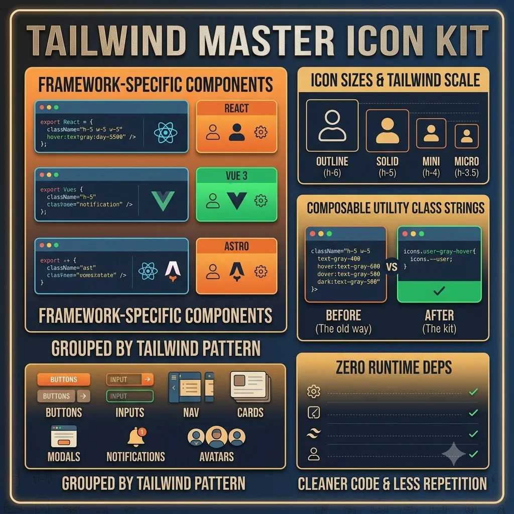
If you use Tailwind and Heroicons together, you’ve probably typed className="h-5 w-5 text-gray-400 hover:text-gray-600 dark:text-gray-500" about a thousand times. This kit fixes that. It’s Heroicons (MIT-licensed) reorganized for the way Tailwind developers actually work — not just raw SVGs, but pre-composed utility class strings for the 200 icons you reach for most often. Instead of writing that whole mess out again, you paste icons.user--gray-hover.
You get framework-specific inline SVG components for React, Vue 3, and Astro. Zero runtime deps, just copy and paste. The icons are grouped by Tailwind component pattern — buttons, inputs, nav, cards, modals, notifications, avatars — so you grab what matches what you’re building. Four sizes per icon match Tailwind’s scale: outline (h-6), solid (h-5), mini (h-4), micro (h-3.5). That’s it. Just cleaner code and less repetition.